


The debate about whether to use REM or Pixel for web design is an ongoing one, and everyone indeed has their own opinion on which works better. However, there are some definite advantages to using REM over Pixel. but first, let’s learn the difference between REM and PX.
Difference Between REM and Pixel
The main difference between REM and Pixel is the way that they measure font size:
Pixel measures font size in a fixed unit, while REM measures font size relative to the root element of the document.
so if the size of the root element of HTML is 16px then 2rem will be 32 pixels.
a lot of people say that this barely matters because now the problem with retina scaling and other issues where we have to use remover pixel is now fixed so barely matters what you want to use. but this is not true at all.
The Real Issue
This issue is related to how CSS units respond to browser settings. Users can adjust their browser's default font size in the settings. it is helpful for users that have a visual impairment.
for example, if I am changing the browser font size from medium to large.
and now I am running this simple HTML where I have defined pixel and REM. here the first paragraph has a font size of 16px and the other one has a font-size of 1rem.
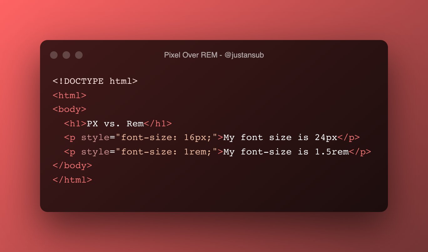
we know that both of them will have the same size, but will both <p> have the same font size when we increase the default browser size? The answer is No!
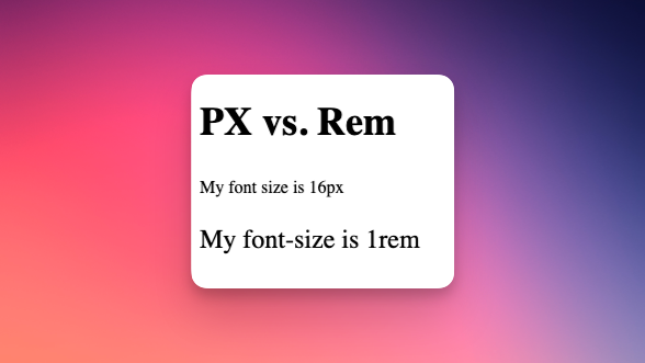
you will notice how the font size defined by rem increased but the font size defined by pixel didn’t Issue relates to how CSS units respond to browser settings. Users who will adjust the font size in settings due to visual impairment will not see a bigger font size.
Moral of the Story
This is an accessibility issue, so when defining font sizes, you should always use rems.