Media Queries Simplified
a way to change the layout of the webpage for different screen sizes
Media queries were introduced in CSS3 and it uses @media rule to include CSS when certain conditions are true.
Media Queries allows you to target any platform you want and write specific styles for that platform, for example, you can change the layout of CSS for a mobile platform where the user opens the app in the mobile platform, this is also called responsive styles because it is responding to different devices differently.
for example:
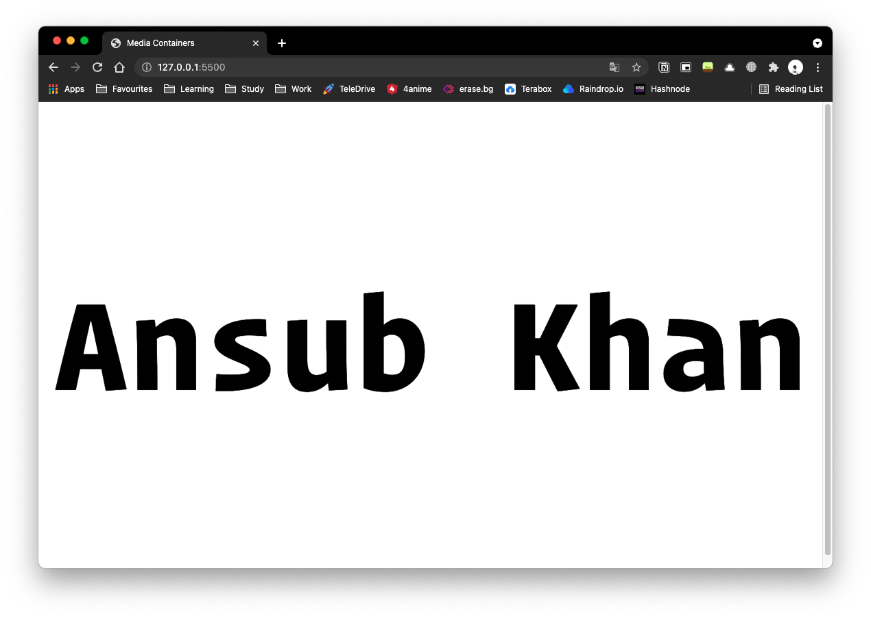
this is the example of the webpage which has a screen size of 1200px:

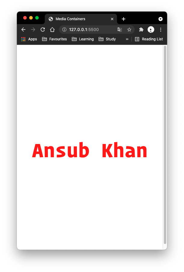
when we are going to change the screen size of this to 500px screen size using this code below:
// if the browser window is smaller than 300px, the color of the font will be changed to red.

@media only screen and (max-width: 500px) {
body{
    color:red;
}
}
it is going to look like this:
Media Query Breakpoints
these are some of the breakpoints for different devices:
Extra Small Phones
@media only screen and (max-width: 600px) {
}
Portrait Tablets and large Phones
@media only screen and (min-width: 600px){

}
Landscape Tablets
@media only screen and (min-width: 768px){
}
Laptops and Desktop
@media only screen and (min-width: 992px){
}
Large Laptops and Desktops
@media only screen and (min-width: 1200px){
}


