CSS animations are a module that lets you animate the element which changes the element from one style to another. and to use the CSS animation we use @keyframes.
before talking about animation, let us make two boxes:
.parent{}- this is going to create a box.child{}- this is going to create a small box inside the parent.
Note: container class is here to make the box come to the center for easier visibility.
<div class="container">
    <div class="parent">
      <div class="child"></div>
    </div>
</div>
.container {
  height: 100vh;
  display: flex;
  align-items: center;
  justify-content: center;
}

.parent {
  background-color: rgb(21, 214, 124);
  height: 400px;
  width: 400px;
}

.child {
  background-color: red;
  height: 50%;
  width: 50%;
}

Transition Property
let's move our box from left to right, for that we don't have to use the animation and keyframe property because the animation of moving a box from left to right is quite simple easy and a one-step process. because the object is moving from left to right that's it.
so that's why we use transition property.
.child {
  background-color: red;
  height: 50%;
  width: 50%;
  transition: transform ease-in 1s;
}

.child:hover {
  transform: translateX(100%);
}
this is going to make to move the child box from left to right when you are going to hover on it.
syntax of transition property is like:
transition: [transition-property] [transition-duration] [transition-timing-function] [transition-delay];
transition property : it is used to specify which specific property you have to change.
transition-duration: this determines the duration of the transition
transition-timing-function: this is used to define a function that describes how a transition will proceed over its duration, allowing a transition to change speed during its course. learn more about here
transition-duration: it is used to define a length of time to delay the start of a transition.
but what if we want to make the child circle around the parent box?
now here comes the role of animation property
animation also has a lot of properties but we can use a shorthand animation to include all the properties. so let's get started:
.child {
  background-color: red;
  height: 50%;
  width: 50%;
}

.child:hover {
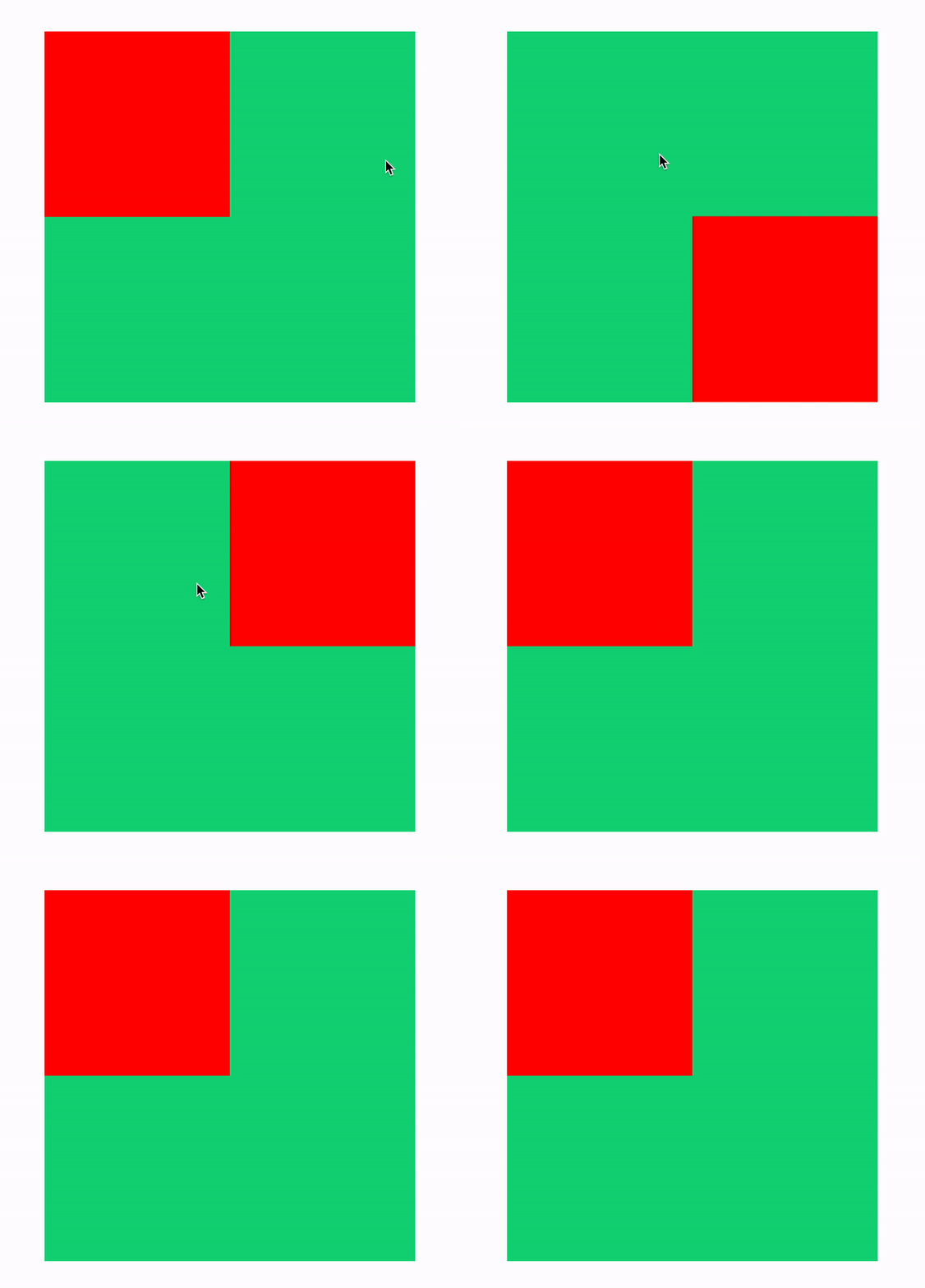
  animation: left-to-right 1s ease-in forwards;
}

@keyframes left-to-right {
  0% {
    transform: translateX(0);
  }

  30% {
    transform: translateY(100%);
  }

  60% {
    transform: translateX(100%) translateY(100%);
  }
  100% {
    transform: translateX(100%);
  }
}
first you will see that the animation actually has a name "left-to-right" and then i am using that same name in the keyframe. this is to determine that animation is going to apply on that exact keyframes.
second is that you will find forwards, it actually comes from
animation-fill-modeproperty which is actually saying that you have to stop the animation at 100% otherwise what animation is going to do is that it will reset the animation when it will reach to 100% and the box will come again to 0%.
Sub-Properties of Animation
- animation-name: declares the name of the @keyframes at-rule to manipulate.
- animation-duration: the length of time it takes for an animation to complete one cycle.
- animation-timing-function: establishes preset acceleration curves such as ease or linear.
- animation-delay: the time between the element being loaded and the start of the animation sequence (cool examples).
- animation-direction: sets the direction of the animation after the cycle. Its default resets on each cycle.
- animation-iteration-count: the number of times the animation should be performed.
- animation-fill-mode: sets which values are applied before/after the animation. For example, you can set the last state of the animation to remain on screen, or you can set it to switch back to before when the animation began.
- animation-play-state: pause/play the animation.
and this will be the result:
so that's CSS Animation for you, this is actually quite the basics of animation there is a lot more to CSS Animations, I will provide some links which can help you become a PRO in CSS Animations:
CSS3 Animation & Transitions Crash Course


